Performance and Accessibility Audit of the Kamala Harris 2020 Website

This is one in a series of posts that will look at the performance and #a11y metrics of the websites for the currently declared 2020 Democratic presidential candidates. Yeah, all of them! For more background on what I’m doing and how I’m doing it check read this.

Home page of kamalaharris.org

kamalaharris.org

Google Lighthouse

Lighthouse scores for kamalaharris.org

Performance: 41 out of 100

The homepage is primarily driven by client side javascript with animations and video galore. The Speed Index and Time to Interactive (11.1 seconds) scores suffer because interactivity and the display of content is delayed until elements animate on screen.

Accessibility: 79 out of 100

  • First visit to the site opens up a Youtube player modal. Keyboard focus is not managed well, so a user must tab through the entire site to get to the Close button and view the content. On the plus side, the ESC key or any click on the page will close this roadblock.
  • ARIA roles are defined for navigation but are invalid.
  • There is not enough color contrast between buttons and their backgrounds.

Best Practices: 86 out of 100

Lighthouse calls for adding a rel=”noopener” to all external links on the site. There is a reason to do this. And it’s a pretty easy fix.

SEO: 98 out of 100

Button tap targets for touch screen devices are not sized large enough to be usable.

Network

  • HTTPS: yes
  • 102 Requests (yikes)
  • 8.5 MB resources
  • Largest asset is a 6.2 MB webm video. Good on them for serving up a modern optimized format but this is a very heavy assets for all but a very fast Internet connection.

Platform

  • WordPress, custom theme.

Notes

This is the first time I’ve noticed a candidate site using the social media AddThis widget for sharing. Somehow this thing keeps getting added all over the place despite overwhelming evidence that NO ONE USES IT. Killing it would go a long way towards improving the site’s performance scores, removing hundreds of KB in javascript and CSS code.

Continue on with the other candidates in the series

Performance and Accessibility Audit of the Bernie Sanders 2020 Website

This is one in a series of posts that will look at the performance and #a11y metrics of the websites for the currently declared 2020 Democratic presidential candidates. Yeah, all of them! For more background on what I’m doing and how I’m doing it check read this.

Home page of berniesanders.com

berniesanders.com

Google Lighthouse

Lighthouse scores for berniesanders.com

Performance: 73 out of 100

For the relative svelteness of the site, a single background video and signup form, I’d expect this metric to be much higher. Time to interactive is 7 seconds, first meaningful paint (when something appears on screen) is 3 seconds. Digging a little deeper my only guess is this poor performance is due to the javascript framework of choice: actionkit.js. I’ll admit I’m unfamiliar with this particular framework but sure enough Bernie and other candidates are counted as clients. Certainly we’ll meet again. *shakes fist in general direction of actionkit*

Accessibility: 67 out of 100

  • Default browser focus outlines appear for all buttons and links.
  • Lighthouse dings them for not having labels on form fields, a big no-no, but looking closer at the source reveals this to be incorrect score. Labels are in fact present.
  • The logo is a yuuuuge missed opportunity to include the most basic of things, “Bernie Sanders”, in a link or heading text. Looking at code such as below drives me nuts!
<h1 class="logo ">
    <a class="logo__link" href="/">
        <span class="sr-only"></span>
    </a>
</h1>

Best Practices: 93 out of 100

Lighthouse only lists adding a rel=”noopener” to the jobs link in the footer. There is a reason to do this. And it’s a pretty easy fix.

I will give the team kudos in their use of a very well optimized background video, weighing only ~31 KB. Not sure what socialist voodoo they did to pull that off.

SEO: 100 out of 100

I Googled Bernie, I got Bernie. Nothing more to say about that.

Network

  • HTTPS: yes
  • 47 Requests
  • 1.6 MB resources
  • Largest asset is the aforementioned actionkit.js, 82.2 KB.

Platform

  • WordPress, custom theme.

Continue on with the other candidates in the series

Performance and Accessibility Audit of the Elizabeth Warren for President 2020 Website

This is one in a series of posts that will look at the performance and #a11y metrics of the websites for the currently declared 2020 Democratic presidential candidates. Yeah, all of them! For more background on what I’m doing and how I’m doing it check read this.

Full disclosure: I have donated $50 to the Warren campaign to date.

Home page of elizabethwarren.com

elizabethwarren.com

Google Lighthouse

Lighthouse scores for elizabethwarren.com
Scores as of initial publish on May 16th, 2019
Update 6-26-2019

Performance: 20 out of 100

Yikes, this performance score is abysmal. I’d chalk this up to the the front-end being entirely built in a client-side javascript framework, but that’s not an excuse.

Webp images are used in many places which shows at least some thought was given to overall performance but there is still much that could be improved.

Warren is becoming famous for the campaign line “I have a plan for that!”, and I hope her team has a plan to fix these issues. Not so secretly, I’d like to help.

Accessibility: 80 out of 100

  • Skip to Content link is present (great!) UPDATE 6-26-2019: Oh no, it’s gone!
  • Main nav is hidden behind hamburger menu icon, with no visible focus state. (Boooo!)
  • Very disappointing that every interactive element save for one is revealed through hover alone. Wayfinding by tabbing is pretty difficult.

Best Practices: 71 out of 100

Loading of offscreen images should be deferred until they are visible.

Scrolling performance is sluggish due to the scrolling event listener used by the AB Tasty plugin to measure how much the page has been viewed. These event listeners should be passive.

SEO: 92 out of 100

One link on the page for /meet-elizabeth uses a generic “Learn More” label. This is a poor practice for accessibility as well.

Network

  • HTTPS: yes
  • 85 Requests
  • 5.1 MB resources
  • Largest asset app.bundle.css at 360 KB. That’s a LOT of CSS. After an inspection I believe the large size is due to including the Font Awesome icon fonts as data URIs. Essentially this is including the entire font in a file that blocks page rendering until it has fully downloaded. Breaking them out would improve her site’s performance.
  • UPDATE 6-26-2019:
    • 89 Requests
    • 7.9 MB resources
    • Largest asset is the hero video at 1.9 MB. It appears the dev team is now serving page specific CSS with a technique known as tree shaking. The homepage CSS bundle is down to only 35 KB.

Platform

  • WordPress, custom theme
  • UPDATE 6-26-2019: second review the site has moved to be a client side React app. No clue what is powering the back-end, there are no tell-tale WordPress signs.

Notes

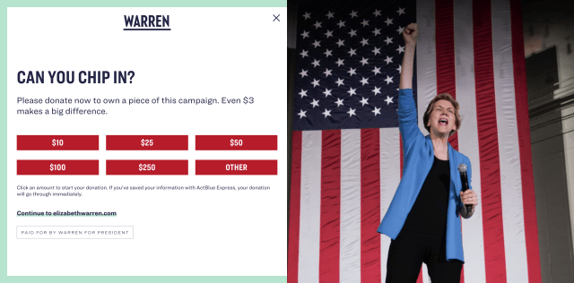
First load of the site has an inaccessible donate form, with the Continue to elizabethwarren.com link an anchor tag with no href. Come on! 😩

Donate form on elizabethwarren.com

Performance and A11Y Audit of the Cory Booker 2020 Website

Home page of corybooker.com

corybooker.com

Google Lighthouse

Lighthouse scores for corybooker.com

Performance: 76 out of 100

There are a number of CSS files and jQuery javascript plugins that are blocking the initial render until they are all downloaded. Bundling these together and removing unused code could improve this score.

Accessibility: 90 out of 100

  • Default browser focus outlines appear for all buttons and links, tab order is logical.
  • This is bad HTML:
<a href="https://shop.corybooker.com/" rel="noopener">
    <button class="booker-button booker-button__shop">
        Gear up
    </button>
</a>
  • Video play buttons aren’t labeled.

Best Practices: 86 out of 100

There is a vulnerability in the jQuery library used, jQuery@1.12.4. This is a common problem found in the WordPress platform. Updating the theme to use a more modern version, or hey no jQuery at all, would be an improvement.

SEO: 82 out of 100

The site is getting dinged in the SEO score for not having a meta description, yet I see it in the source. It may be that this is being rendered client-side.

The document has conflicting canonical URLs.

Network

  • HTTPS: yes
  • 43 Requests
  • 2.4 MB resources
  • Largest asset is an shop-desktop.webp (yay!) but at 362 KB I suspect some bad encoding needs to be fixed. It does not render in a new tab in Chrome.

Platform

  • WordPress, custom theme Bookerstrap (hah!)

Performance and Accessibility Audit of the Joe Biden 2020 Website

This is the first in a series of posts that will look at the performance and #a11y metrics of the websites for the currently declared 2020 Democratic presidential candidates. Yeah, all of them! For more background on what I’m doing and how I’m doing it check out this post.

joebiden.com

Google Lighthouse

Lighthouse results for joebiden.com

Performance: 91 out of 100

That’s really good for a site like this. The biggest knock against it performance wise is the 4.1 seconds time to interactive. This is a measure of how long it takes for a site to load and a user able to interact with it, for example clicking on a button to donate. Faster is better.

Accessibility: 96 out of 100

  • Default browser focus outlines appear for all buttons and links. There is a missed opportunity to to style them to coordinate with the hover states.
  • The image carousel is keyboard accessible.
  • The popup modal to join the campaign appears to be inaccessible and can’t be filled out without a mouse. However it does close with the ESC key.
  • Form fields are missing labels.
  • No contrast issues with any of text were found!

Best Practices: 86 out of 100

In most cases the images on the page are jpgs and could be converted to more optimized formats such as webp.

SEO: 100 out of 100

Funny that this site scores a 100/100 but up until a few weeks ago https://joebiden.info/ was appearing at the top of search results and the .com was nowhere to be found.

Network

  • HTTPS: yes
  • 58 Requests
  • 3.9 MB resources
  • Largest asset is an image contained in a carousel, a 214 KB jpg

Platform

  • WordPress, BEXC theme. I can’t find if this is an off the shelf theme or a custom one with an inexplicable name.

Notes

All in all a very well-performing site, if a bit generic.

Continue on with the other candidates in the series